Get an email when there's a new version of Cascadia Code
| Name | Modified | Size | Downloads / Week |
|---|---|---|---|
| Parent folder | |||
| CascadiaCode-2110.31.zip | 2021-10-31 | 24.9 MB | |
| Cascadia Code 2110.31 source code.tar.gz | 2021-10-31 | 5.4 MB | |
| Cascadia Code 2110.31 source code.zip | 2021-10-31 | 13.1 MB | |
| README.md | 2021-10-31 | 4.0 kB | |
| Totals: 4 Items | 43.5 MB | 0 | |
Shipping from the vaults and crypts of the world, the Cascadia font family returns! Unearthed after centuries shrouded in myth, ḭ͕t͕ co͓mͅe̜̹̻s!
This is a fairly comprehensive (and spooky!) 🐛💀 update resolving many open issues.
NOTE: If you're using the version of Cascadia (Code, Mono) that ships with Windows Terminal, an update will be available in the coming weeks. In the meantime, you can choose to install a new version of the font (which Terminal may ignore) or switch to the powerline face.
Arabic bugfixes
- [x] Closes [#532] 👻 - Additional positional variants added
- [x] Closes [#535] 🍂 - Corrected hamza form
-
[x] Closes [#540] 🎃 - Dot arrangement corrected

-
[x] Closes [#541] 🧹 - Was due to the use of anchors on those glyphs. These have been removed so the glyph can render as spacing.
- [x] Closes [#542] 🌕 - This was partly due to a bug in Harfbuzz. It has been resolved both on the font side (through a different implementation) and in Harfbuzz.
-
[x] Closes [#549] 🦸♀️ - Design corrected

-
[x] Closes [#555] 💀 - All letter glyphs removed from Arabic Presentation form unicode slots to avoid situations where the glyphs are not behaving as expected.
Arabic changes
[#543] - uni0615 removed as Cascadia Arabic not intended to support Quranic
Other bug fixes
-
[x] Closes [#488] 🔪 - Finally made the italic www ligature have the proper number of
ws.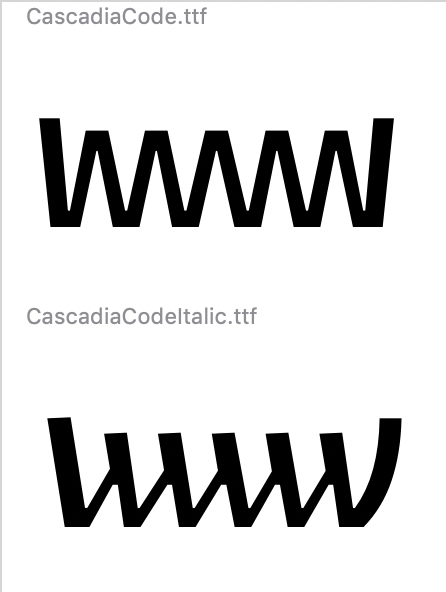
-
[x] Closes [#436] 🧟♀️ - Extended length of Powerline 'caps' to avoid situations where rounding can prevent overlap. This may cause problems if the caps are used next to one another, but that seems an unlikely scenario given what I've reviewed of Powerline styles.
-
[x] Closes [#521] 🤖 - enlarged the size of the grave character to make it more recognizable / legible in code.

-
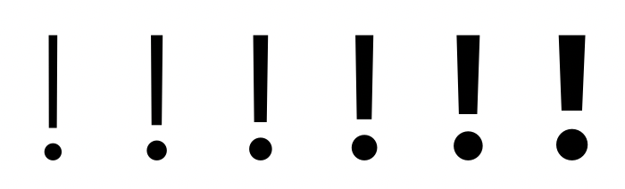
[x] Closes [#524] ☠️ - Added some more differentiation in stroke, and also created more space using hinting.
-
[x] Closes [#525] 🧙♂️ - tweaked the braces to be more twisty and create better differentiation from the parens.

-
[x] Closes [#529] 🧛♀️ - Changed year :P
- [x] Closes [#546] 👹 - ij no longer masquerading as a mark.
-
[x] Closes [#563] 🧟♂️ - corrected
loclfeature for proper Serbian rendering
-
[x] Closes [#571] 🦹♀️ - corrected overshoot
- [x] Closes [#572] 🕷 - ratio symbol added
- [x] Closes [#577] 🍁 - shifted heights of box drawing lines to better align with block glyphs. Will reduce risk of non-joining forms under certain conditions.
